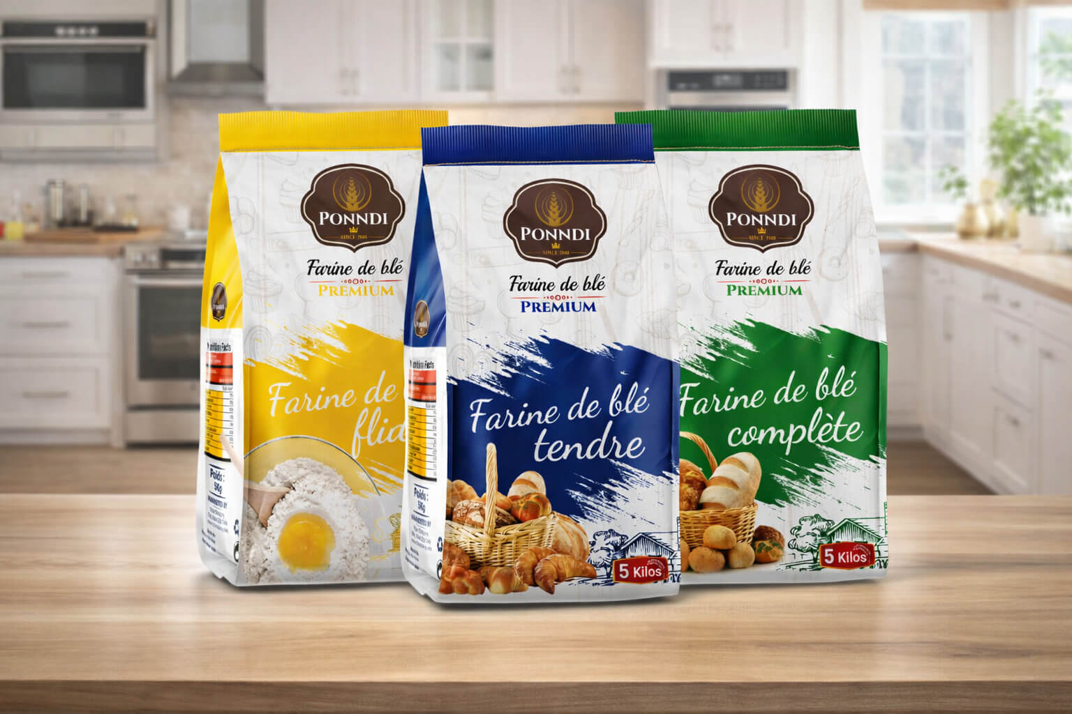
This flour packaging design project was created for a French client seeking to modernize its product while respecting local market visual conventions and consumer expectations. The goal was to improve shelf readability, strengthen brand identity and make the product easier to understand.
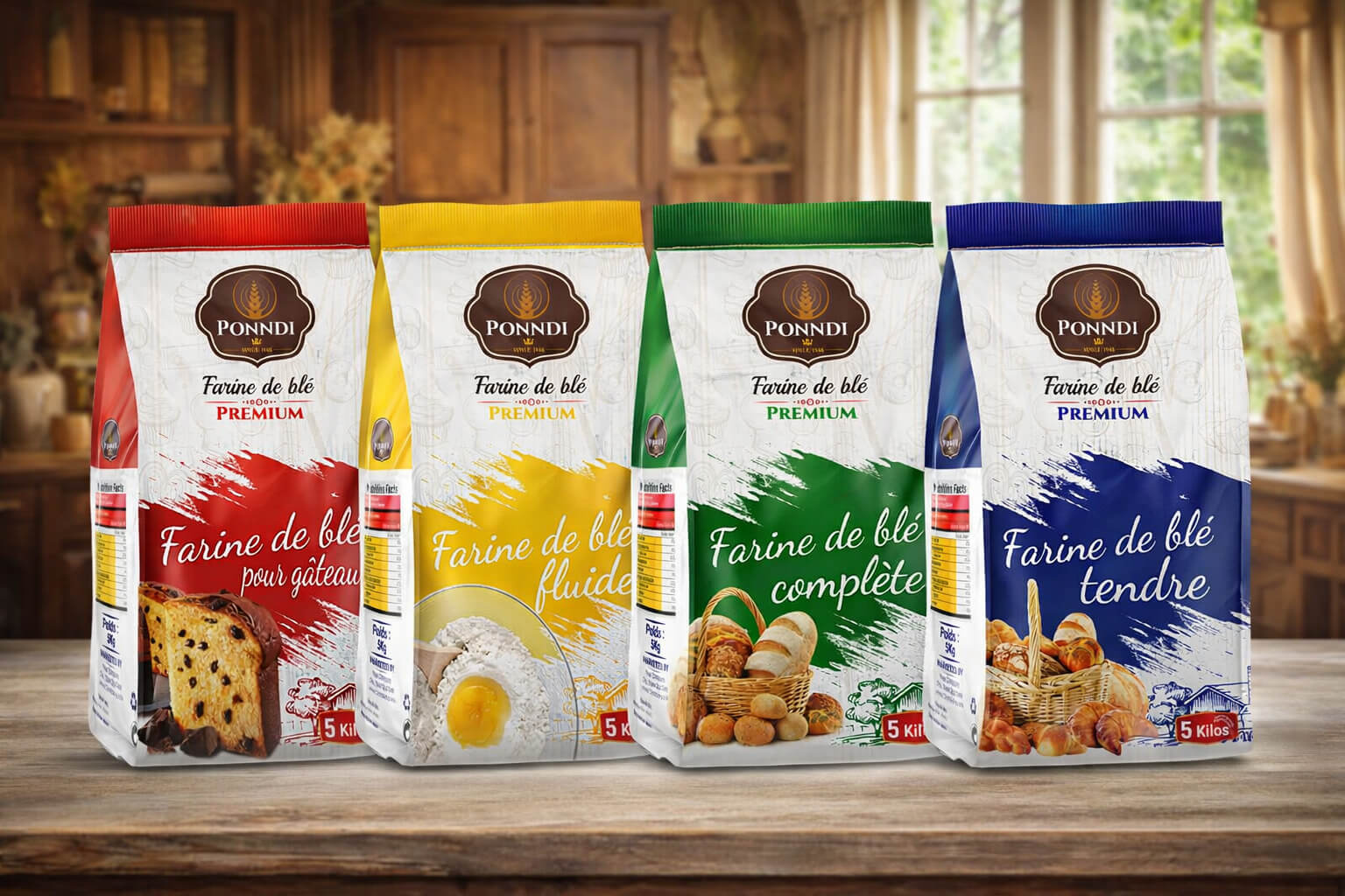
The agency strategically analyzed product uses, industry trends and competitors before designing clear, functional and appealing packaging. It features distinctive typography, an effective hierarchy of information such as weight, variety and logo, and a color palette evoking natural ingredients and tradition.
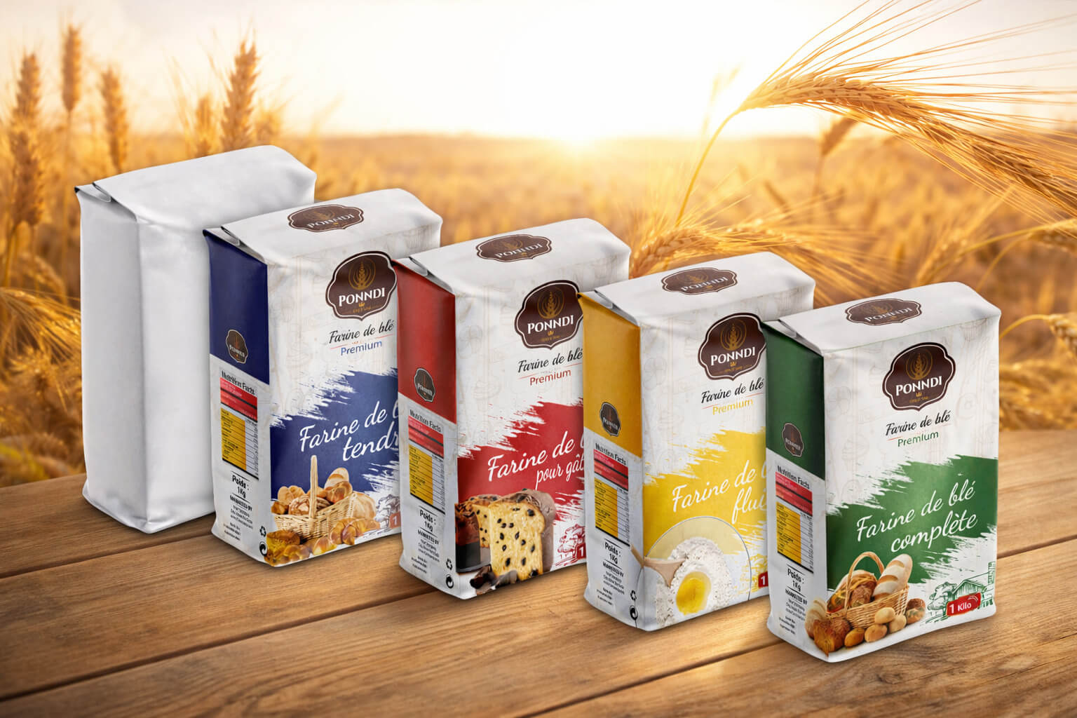
The result is a professional design ready for printing and manufacturing, helping the flour stand out among similar products in supermarkets and stores while conveying quality, trust and consistency with the client's French identity.